A knee-jerk reaction to all the knee-jerk Bugatti ads
By a professional (ahem) copywriter.
The other day, some millionaire (urgh) imported a supercar; we didn’t care. Within 24 hours, Zambia’s advertising industry had capitalised on the trend - pitching everything from new tires to insurance to air travel with stock images of the Bugatti Veyron. There is, seemingly, a new ad every hour. Zambians enjoyed the distraction from everything that’s been going on lately, and so did we - until, like, the dozenth ad.
Some rich dude is in his lair right now, stroking a cat, laughing at us all.
Someone went ahead and marketed a primary and secondary school with the supercar at centre-stage, which isn’t a bad shout if your message is along the lines of, say, This is how far your child could go in life, if you enrol with us, etc. But what have speed and shock ever had to do with an excellent report card?
The design template’s pretty neat, though, and whoever chose this specific photo did a nice job of matching it to the colour of the headline text. That hard work, though, is somewhat undone by the weird copy and the bland whiteness that’s holding most of it.
Grade: C+
It’s hard to argue convincingly against this one. The creative team chose a superb-looking edition of the car, and actually remembered to shadow it against their canvas. The headline is simple, reasonably clever, and everything just seems painlessly executed. Job done.
I’ll take away minimal marks for the typography, which could mayyybe have been slightly more dynamic.
Grade: B
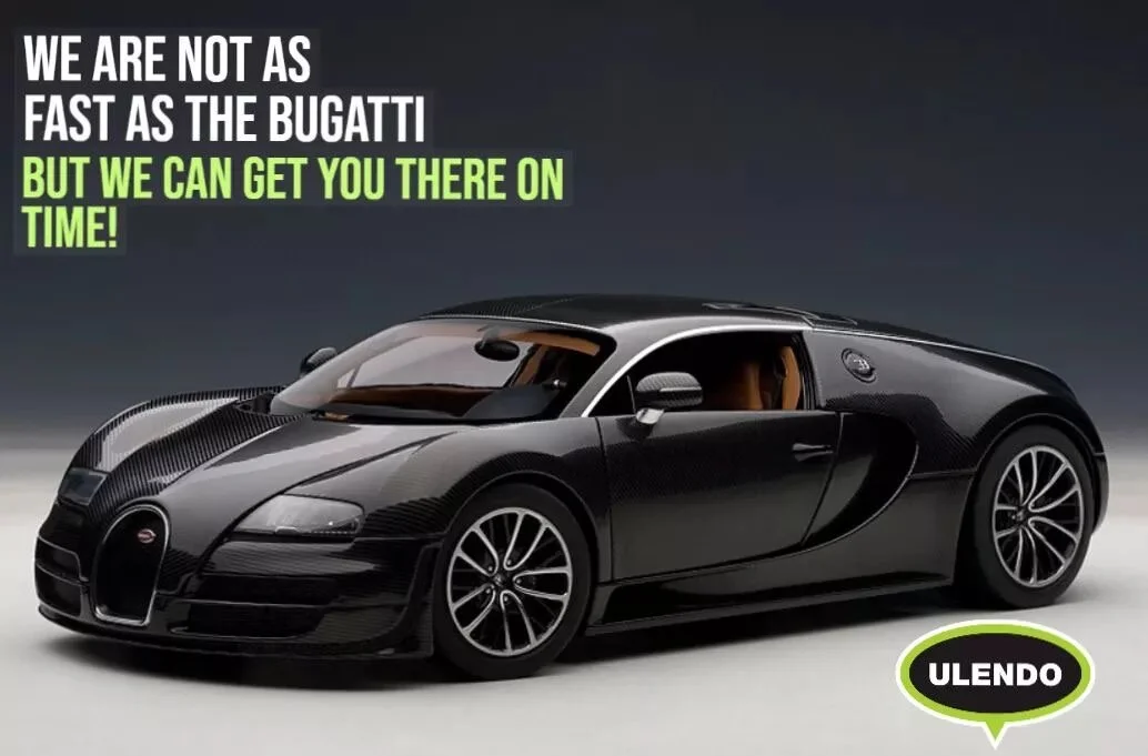
I mean, this does a similar thing with the Mahogany airlines concept, perhaps with a superior layout and colour palette. That Ulendo logo really pops, even though it could do with a little more breathing room, further away from our centrepiece. I would also give the Mahogany headline a slight edge over theirs, because their wording is more precise. They actually took a humble-dump on the car, which is rather impressive.
Grade: B
Look, I get it. They’ve done a nice little job there, with their image selection and their background, and their headline is succinct and exclamative. But is the headline itself really adventurous? I feel like no, and that’s what’s missing from all these ads in general: a little less reverence, and a little more sass, cheekiness.
Grade: B
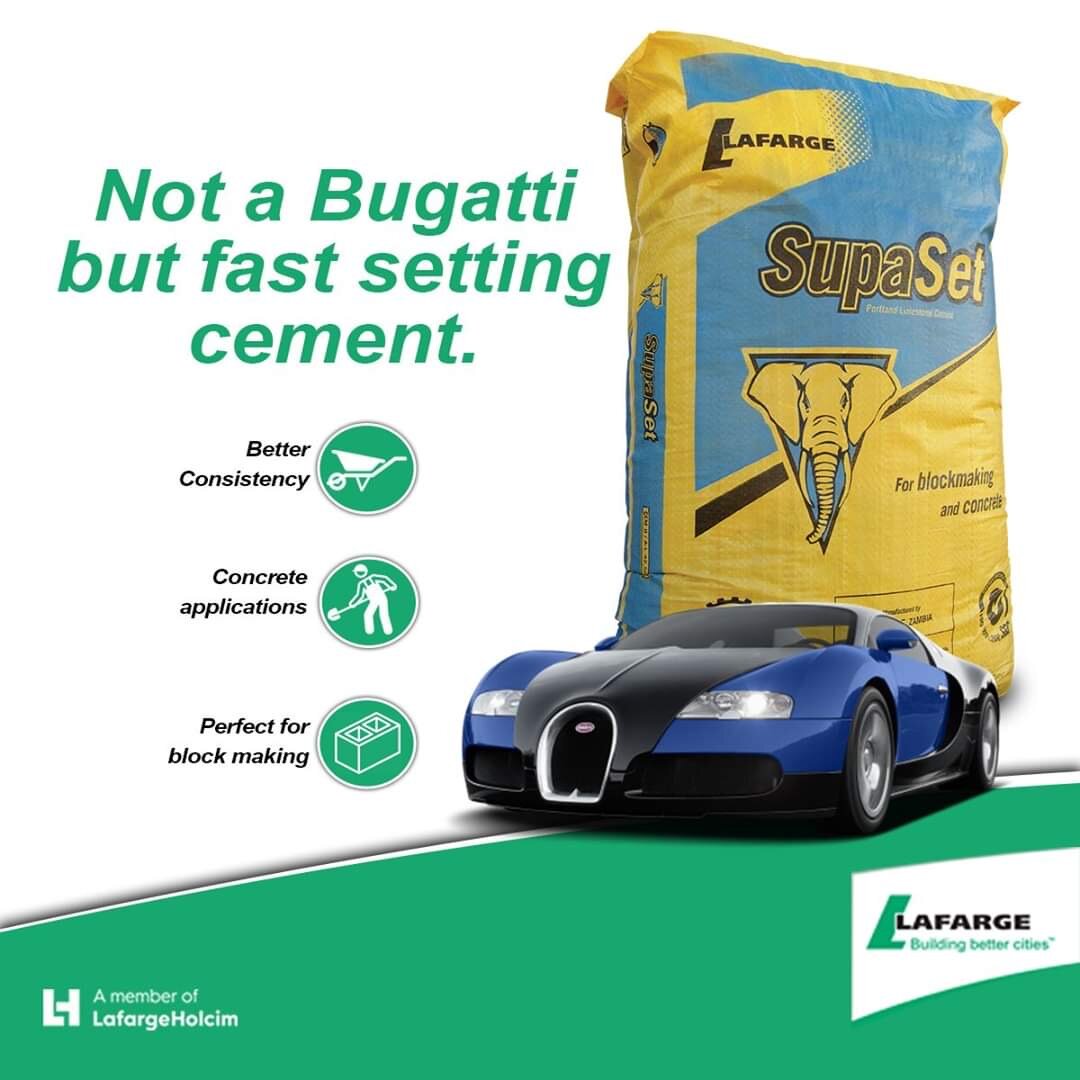
The sell here feels a tad too aggressive. This creative team has (neatly) highlighted speed in how quickly their cement brand sets, and could certainly have had more fun with the benefit bullets just beneath that - but they sort of just dive headfirst into selling, um, cement.
The image selection, also, clashes with the brand’s colour palette for still media - at top speed.
Grade: D
As evidenced already, I’m not big on the hard sell. There’s also a lot going on here, with the copy, which doesn’t sit very well inside the tiny allotment of a Facebook post. I might have recommended a tighter message … I don’t fully understand the body copy; we could have insured your car, Mr. Millionaire, if it hadn’t stayed stuck in transit so long, but yo if you’re down for a plan or what have you we’re still here for you anyways? Um, what?
Grade: D.
This is exactly what an ad look like when a brand’s style guide has been refined over several decades. A logo that sits and also pops on the plainest of backgrounds. A brand voice, in that headline, that needn’t flap its wings excessively. The service offered, beneath the gentle slap across your face. Class.
Grade: A -


